¶ Taking pride of place at the head of every new paragraph, the pilcrow had carved out a literal niche for itself at the heart of late medieval writing. Boldly inked by the rubricator, pilcrows grew ever more elaborate and time-consuming to add. Unfortunately the deadline is not a modern invention; occasionally, time would run out before the rubricator could complete his work and the white space carefully reserved for the pilcrow went undecorated. With the advent of the printing press, the volume of printed documents to be rubricated grew exponentially and it became increasingly difficult to attend to them all. The pilcrow became a ghost, and the indented paragraph was born in its stead.1
¶ Robbed of its raison d’être, the pilcrow retreated to the margins of typography. Though it found shelter in the worlds of proofreading (where it signified the point at which a paragraph should be split in two2) and legal documents (where it formed a double act with the section mark to create reference marks like this: §5, ¶123), its brief reign as the de facto standard paragraph mark was over.
Even after this ignominious relegation from mainstream use, the pilcrow refused to be done away with completely and was still resurrected from time to time to serve in its original role. Now functioning largely as a boutique character used to bring a historical or typographical flourish to a work, one of the pilcrow’s most intriguing appearances in this capacity came in An Essay on Typography,4 written by the famed English sculptor Eric Gill. Born in 1882 and brought up the son of a Protestant minister, at 31 Gill converted to Catholicism5 and led an increasingly ascetic life as a monkish, artistic polymath. His charisma and trenchant views attracted a retinue of like-minded contemporaries to a series of rural communities — communes, almost — with Gill at their centre.
By the time Essay was published in 1931, Gill had refined his view of the competing worlds of industrialisation and the Arts & Crafts movement into a philosophy espousing a simpler way of life free from the uniformity of mass production, and Essay is as much a manifesto as an educational textbook. In fact, the book’s creation was a loving paean to that same philosophy: Gill wrote the text, hand-set it in a typeface of his own design and hand-printed the first edition with his printing partner René Hague.6
Essay’s bold use of the pilcrow stands out to the modern reader from its very first line:
¶ The theme of this book is Typography, and Typography as it is affected by the conditions of the year 1931. The conflict between industrialism & the ancient methods of handicraftsmen which resulted in the muddle of the 19th century is now coming to its term.4
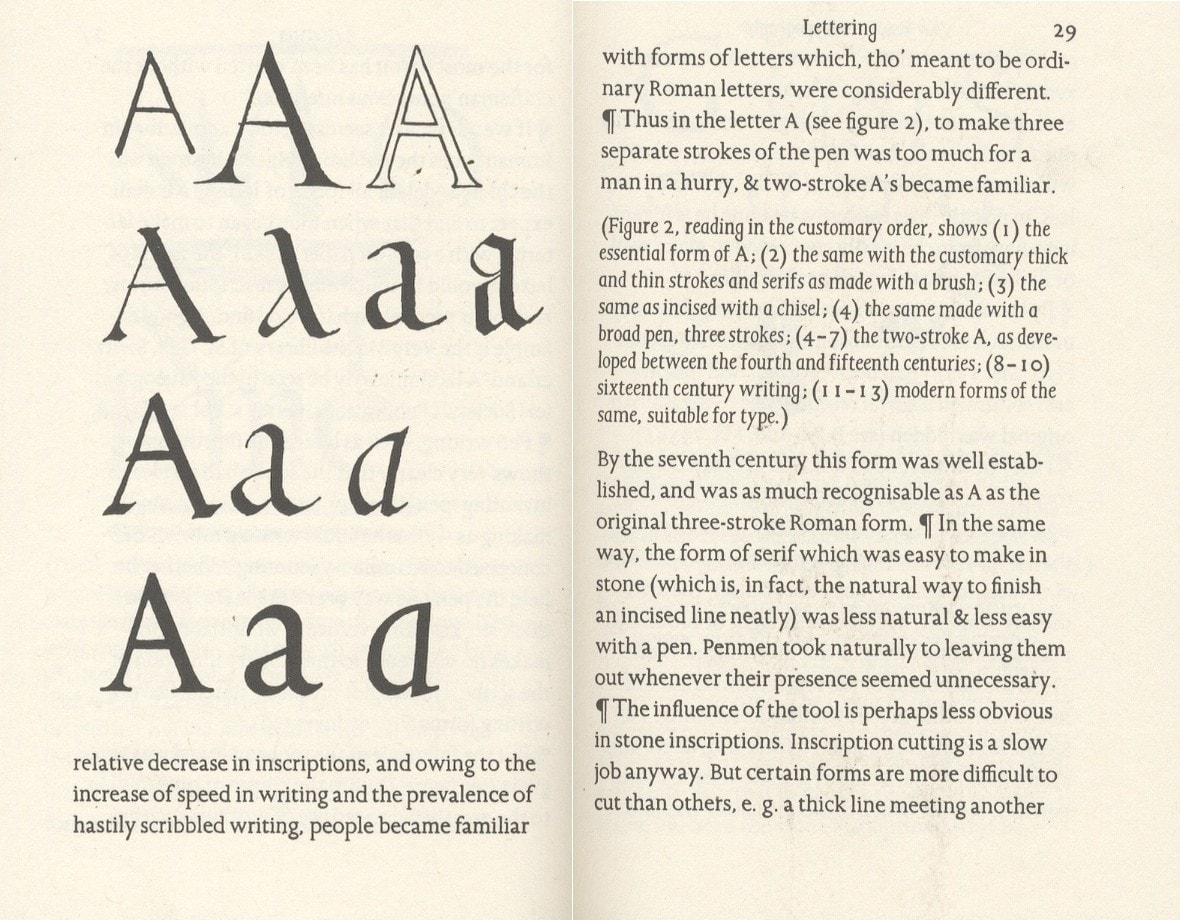
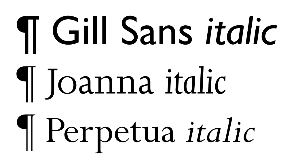
¶ With Essay, Gill made creative use of the pilcrow, both recalling its medieval heyday and introducing a subtle extra level of semantic meaning into the bargain: a pilcrow at the start of a new line introduces a new thread of discussion, while a pilcrow in running text separates paragraphs within that discussion.7 The result is text which looks haphazard at first (why does the pilcrow jump from the start of the line to the middle?) but which marries simplicity of expression with richness of meaning — mirroring, perhaps, the author’s Arts & Crafts ideology. ¶ Essay is filled with other hints of that same philosophy. Whereas many books justify text to fill each line and hence provide a uniform appearance, Gill used a ‘left justified’ or ‘ragged right’ setting to mimic a handwritten manuscript; abbreviations like ‘&’, ‘tho’’ and ‘sh’ld’ save space and evoke medieval scribal tradition, and illustrations are all taken from engravings cut by the author himself.
Gill’s Joanna — the slab-serif typeface in which Essay is set — was based in part on his earlier Perpetua type and was described by the artist himself as “a book face free from all fancy business”. This is not the whole truth, however, and Joanna bears a number of idiosyncratic touches which elevate it from its supposed plainness. Based on Roman letterforms, for instance, Gill deviated from the heavy contrast between horizontal and vertical strokes traditionally used in those letters and adopted instead a calligraphic style with more consistent stroke widths.8 Perhaps most noticeably, the narrow italics slope at a shallow 3° angle and forgo the traditional italic forms for ‘f’, ‘k’, ‘v’, ‘w’ and ‘z’.9 Joanna lends Essay a distinctive air and an easy readability.
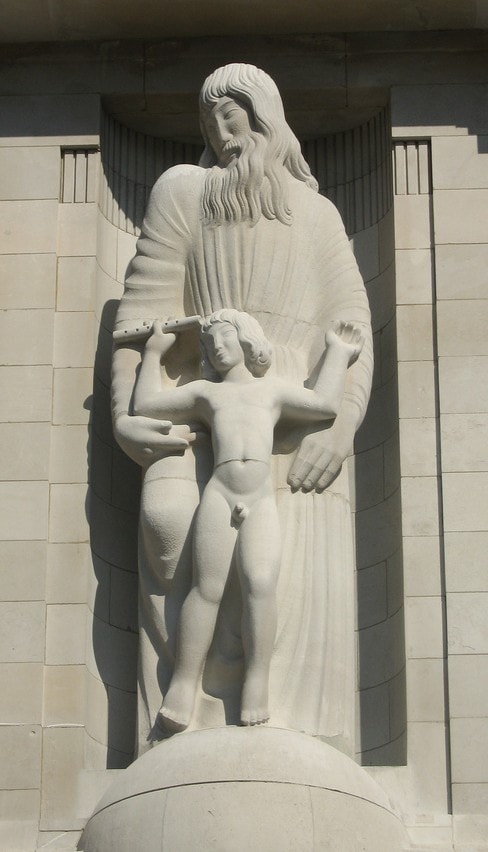
Although today Gill’s typefaces are his most visible work, during his lifetime his chief occupation was as a sculptor, and his prodigious output as such seemed positively calculated to bait the prurience of the day. His first major commission was to carve the Stations of the Cross (a traditional Catholic depiction of Christ’s final hours) for Westminster Cathedral, and churchgoers were shocked by their unspiritual directness.10 While working on the Stations in the cathedral, a woman approached Gill to tell him that she did not think they were nice carvings; he responded, in characteristic form, that it was not a nice subject.11
Another of his works, a near-life size carving of a couple entwined in a sexual embrace, posed problems both in creation and exhibition. Gill was forced to post his apprentice outside the modelling sessions in which his sister Gladys and her husband Ernest posed for the sculpture. Initially sold to a local private collector with a penchant for similarly racy works of art,12 tastes had become sufficiently liberal by 1949 that the sculpture could be sold at auction. Even then, Gill’s original title for the piece (as recorded in his private diary) was still considered too brazen, and so the cheerfully direct ‘They (big) group fucking’ became the rather more circumspectly-named ‘Ecstasy’ for public consumption.13
Despite frequent forays into then-taboo subject areas, after his death Gill remained well-known mainly for his artistic successes and staunch Catholicism. The Eric Gill known to his close-knit family and followers, however, was a startlingly different man. Twenty-one years after his death in 1940, the BBC broadcast an hour-long radio documentary about Gill’s life, and in it could be discerned the first hints of the extraordinary gulf between the artist’s public façade and the reality of his private life. In the programme, René Hague — now husband of Gill’s daughter Joan — spoke about his father-in-law’s attitude to evil:
I wonder whether Eric really believed in evil. He would talk about the evils of industrialism, he would talk about things going wrong, but he certainly didn’t believe that there was any ‘bad thing’. He didn’t believe in evil in that sense, that anything in nature could be evil. That was one of the reasons why he was willing to try anything, anything at all, but quite literally. Either right or wrong, or supposed to be right or wrong, he’d say “Let’s try it, let’s try it once, anyway.”14
The awful truth behind Hague’s musings became clear in 1989 when an unflinching biography revealed incest, child abuse and even bestiality within the Gill household.15 The artist’s posthumous reputation was rocked by these revelations, yet despite this (or perhaps partly because of it), Gill remains a resonant name within the typographical world and Essay one of his most enduring contributions to it.
The pilcrow never quite recovered from its mauling at the hands of the printing press, and despite occasional celebrity appearances as a paragraph mark (such as in An Essay on Typography), it remains largely alienated from its traditional role. As compensation, perhaps, the pilcrow has since acquired a sort of talismanic power for those in the know, especially in the worlds of typography, design and literature. Jonathan Hoefler, designer of Hoefler Text (one of the typefaces in which Shady Characters is set), penned an essay about the joys of designing pilcrows;16 the Pilcrow Lit Fest takes its name from the character,17 and the fictional hero of Adam Mars-Jones’ second novel takes ‘Pilcrow’ as his pseudonym, comforted by its status as an outsider.18
Hints of the pilcrow’s heritage do still crop up in unexpected places. Many word processing programs, for example, support the display of ‘formatting’ or ‘non-printing characters’ — the tabs, word spaces and carriage returns which give a document its structure — and most often, the button which invokes this feature is decorated with a pilcrow. In fact, such word processors also use pilcrows to represent new lines and dots to show spaces when in this mode, lending the average computerised document a dignified medieval appearance.
If the pilcrow is ever to be rehabilitated, its best chance lies with another rather more significant computerised innovation. The internet has fostered a new burst of interest in typography: amateur typographers design countless new fonts on inexpensive computers; personal web pages have democratised typesetting in a way unimaginable to Gutenberg or Gill, and disused characters have been rescued from obscurity to add spice and dignity to the everyday exchange of information. The pilcrow among them has once again carved out its niche as a paragraph mark, and is returned to its former glory in the glow of the computer screen.
- 1.
-
Haslam, Andrew. “Articulating Meaning: Paragraphs”. In Book Design, 73-74. Laurence King, 2006.
- 2.
- Unknown entry ↢
- 3.
-
Eckersley, Richard. “Pilcrow”. In Glossary of Typesetting Terms, 78+. University of Chicago Press, 1994.
- 4.
-
Gill, Eric. An Essay on Typography. David R Godine, 1993.
- 5.
-
MacCarthy, Fiona. “Ditchling Village, 1907-1913”. In Eric Gill. Faber and Faber, 1989.
- 6.
-
Hutner, Martin., and Jerry Kelly. “A Century for the Century : Fine Printed Books from 1900 to 1999”. In A Century for the Century : Fine Printed Books from 1900 to 1999. Grolier Club ; David R. Godine, Publisher, 2004.
- 7.
-
Thomson, Mark. “Visions of Joanna”. Eye Magazine, no. 62 (2006).
- 8.
-
“Joanna”. Monotype Imaging, March 2011.
- 9.
-
Bringhurst, Robert. “11.2 Serifed Text Faces”. In. Hartley and Marks, Publishers, 2008.
- 10.
-
Rogers, Patrick. “Stations of the Cross”.
- 11.
-
MacCarthy, Fiona. “Ditchling Common, 1913-1924”. In Eric Gill. Faber and Faber, 1989.
- 12.
-
MacCarthy, Fiona. “’Mad about sex’”.
- 13.
-
“Ecstasy by Eric Gill”. Tate, March 21, 2011.
- 14.
-
Cleverdon, Douglas, and Guy Brenton. “Portrait of Eric Gill”. BBC, 1961.
- 15.
-
MacCarthy, Fiona. Eric Gill. Faber and Faber, 1989.
- 16.
-
Hoefler, Jonathan. “Pilcrow and Capitulum”. Hoefler and Frere-Jones, March 12, 2008.
- 17.
-
Guth, Amy. “Pilcrow Lit Fest”.
- 18.
- Unknown entry ↢
Comment posted by Avery on
I’m afraid some URLs in your footnotes aren’t working…
Comment posted by Keith Houston on
Hi Avery,
Thanks for the notice! I think you’re probably talking about the link to Eric Gill’s ‘Ecstasy’ at the Tate — I’m aware the link is broken and will fix it as soon as possible, likely tomorrow.
Comment posted by Keith Houston on
Hi Avery — links are all now fixed. Citeulike seems to escape characters like ‘&’ and ‘_’ in URLs, and so I’ve had to use goo.gl for certain links for the time being. Please let me know if anything is still broken!
Comment posted by Stephen Chrisomalis on
Dear Keith,
I just discovered your wonderful essay on the pilcrow and am looking forward to your future work. I’ve written at my own blog, Glossographia (http://glossographia.wordpress.com) about the ampersand and about quotation marks, from a historical-social perspective, but nothing like this. Thanks so much for all this work!
Comment posted by Keith Houston on
Hi Stephen,
I’m glad you like the site, and thanks for the mention on your blog! I’ll be covering the ampersand in a future entry and will try my best to do it justice.
Comment posted by Cybele on
Some years ago, “Samsonite & Delight-Ya”
was the name of our comical accordion duo.
When a guitarist turned our twosome into a trio,
we bestowed upon him the moniker “Ampersand”.
Looking forward to reading more about that character!
(Additionally, as a professional proofreader,
I’ve enjoyed your previous installments.
As one who is optically challenged,
I’ve appreciated the size of your font!)
Comment posted by Keith Houston on
Hi Cybele — thanks for the comment! I’m glad you’re enjoying the site. The ampersand will be appearing in due course.
Comment posted by andrew wilson lambeth on
hi keith
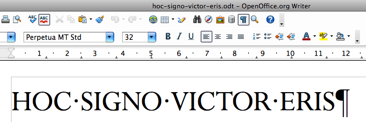
a delicious wrap to your pilcrow articles : thank you . as an aside, another curious detail in gill’s essay is his cutting of two different sizes of capitals for the joanna face he printed it with . this unusual ( well, unique, i suspect ) variant cap size is embedded at the start of, and within, the sentences inside the paragraphs, whereas his full-height caps only appear directly after the pilcrows . gill, then, is capriciously, but so subtly, drawing our attention to the start of each paragraph with both a pilcrow and an upstanding capital to match
Comment posted by Keith Houston on
Hi Andrew,
I hadn’t noticed that at all! Having just taken a look at Essay, though, you’re absolutely right. I’m not sure what I think about it; I understand what Gill was trying to do, but now that I’m aware of it the visual effect is quite distracting. I wonder if the effect is achievable in CSS?
Comment posted by andrew wilson lambeth on
don’t know nuffing about css, i’m afraid, keith ( except it looks great the way you do it ! ) . some vindication for gill’s innovation lies in the fact that you hadn’t noticed the different cap sizes until it was pointed out . which is to say, it presents no distraction until the reader stops reading and starts looking . that must be—and must always have been—true of every new typographic trick, i’d have thought . the wonder is that we absorb these inventions, these distractions, so rapidly and easily into the blinkered sweeps of our everyday reading practice
Comment posted by Keith Houston on
Hi Andrew,
Having had a quick look at the current CSS3 fonts module, I don’t think it’s possible, at least not without mangling the HTML markup behind it.
But yes, it’s a neat trick, and thanks for mentioning it.
Comment posted by Isaac Linder on
Just discovered your lovely, elegant blog and this great article while fishing around for insight into the history of indentation. After reading this article it make perfect sense the indent is really just the leftover site of the bereft pilcrow, but I was wondering if you have any insight into the indent itself- why it didn’t end up being pushed out of the way and filled up in modern typography? As one of those lovely absences like spacing itself, kerning, tracking, rivers, leading, the exergue of coins, &c. that let you catch a glimpse of what Foucault called “the calm sand of the page”, I’m interested if you know of anyone whose thought about the roles of the indent as we know if today? In modern printing do you think it’s just keep it around as a relic out of habit? I’d love to hear what you think & can’t wait for your post on the ampersand!
Comment posted by Keith Houston on
Hi Isaac,
Thanks for the comment! As I understand it, the indent remains in use because it has practical value in delineating adjacent paragraphs without the need for a vertical gap between them. Robert Bringhurst’s Elements of Typographic Style seems to agree, and he has a lot more to say about the ‘vertical motion’ of text on the page. I’d highly recommend his book!
There’s no need to wait for my articles on the ampersand — they’re already available here.
Comment posted by Jean Richards on
The use of the pilcrow in the bible is very strange. It doesn’t seem to indicate anything…at least not that I can discern. The placement of the pilcrows is consistent from version to version. Yes, they come at the beginning of a sentence or paragraph, but without rhyme or reason, sometimes in the middle of a chapter, sometimes in the beginning, but mostly apparently at random. Who put them in? Why do all editions and translations use them in the same places, and why do they seem to be used at random? Is it possible that t hey indicate various sources for the text? I have been puzzled about biblical pilcrow placement for years. Thank you in advance.
Comment posted by Keith Houston on
Hi Jean,
My understanding is that in more or less all books that use them, pilcrows function as sentence, paragraph or section markers. (When that isn’t case, they’re usually there as footnote reference marks or simply as decoration.) I’m not an expert, but as I understand it this is generally true of Bibles too. If there’s a colophon or copyright page in your copy, maybe you could try getting in touch with the publisher?
I hope this helps, and thanks for the comment!
Comment posted by Joel Mielke on
Your Jonathan Hoefler, “Pilcrow and Capitulum” link is now broken. They do, though, have a new post on pilcrows:
https://www.typography.com/blog/pilcrow-capitulum
Comment posted by Keith Houston on
Thanks for catching that, Joel. Fixed now.