From its ignoble beginnings a century after Tiro’s scholarly et, the ampersand assumed its now-familiar ‘&’ form with remarkable speed even as the Tironian et stayed rigidly immutable.
The symbol’s visual development is perhaps best documented in a formidable piece of typographical detective work carried out by one Jan Tschichold, a graphic designer born in Leipzig in 1902.1 Famed as an iconoclastic rule-maker and breaker, Tschichold swung from extreme to extreme in a career which rewrote the rules of book design and typography. His 1928 manifesto Die neue Typographie2 called for the abandonment of traditional rules of typesetting in favour of rigorous Modernism. Then, arrested by the Nazis in 1933 as a ‘cultural Bolshevik’,3 Tschichold reacted strongly to his ill-treatment at the hands of the Third Reich and repudiated his earlier work, seeing ‘fascist’ elements in the strictures of Modernism. In the process, he earned the ire of his contemporaries as a betrayer of his own principles.4 Despite this, his work remains influential even today.
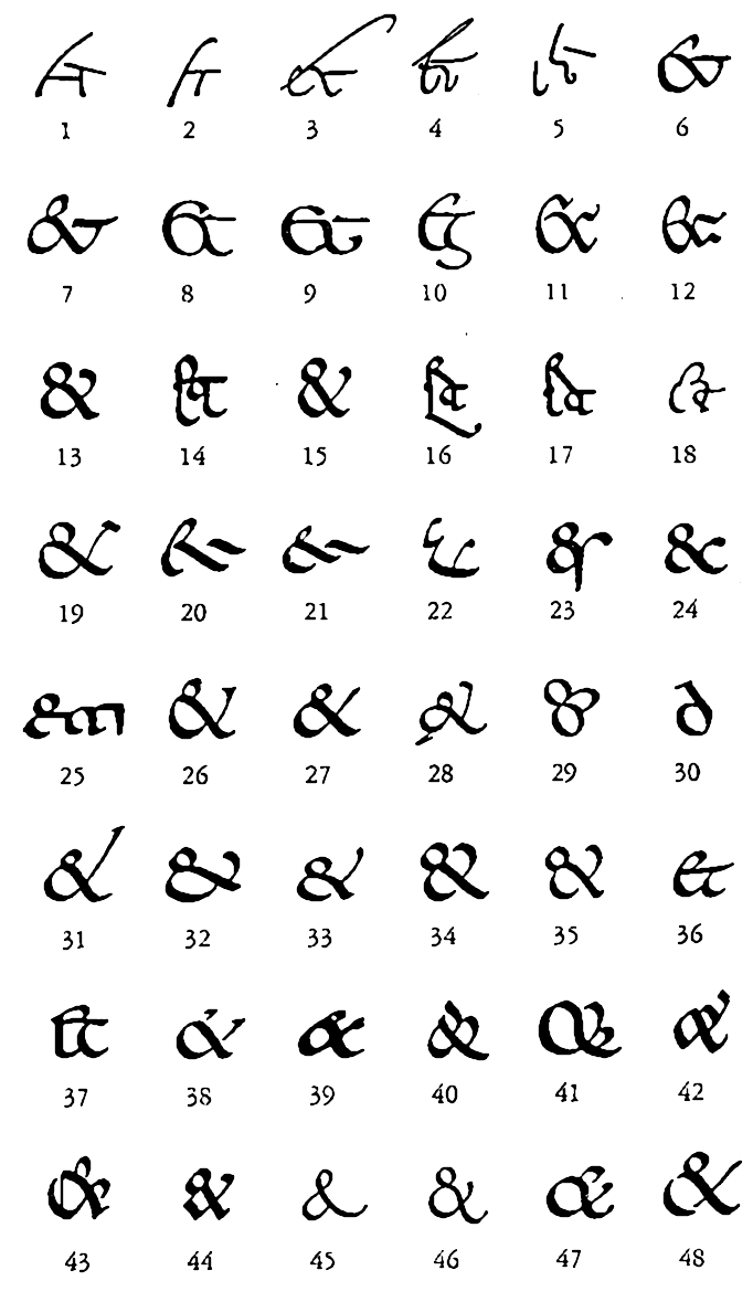
Tschichold’s masterful contribution to the study of the ampersand came in 1953 in the form of a short booklet named Formenwandlungen der &-Zeichen,5 or The ampersand: its origin and development,6 as its English translation would have it. Drawing on earlier works by Paul Standard7 and Frederick Goudy,8 Tschichold collected hundreds of ampersands to chronicle the character’s evolution from 1st century Pompeiian graffiti, through medieval manuscripts, and finally to 19th century printed forms. Even a single page of Tschichold’s menagerie of ‘and’-signs contains an embarrassment of typographical riches.
In its serried ranks of ampersands, Tschichold’s paper traces the divergent forms the ‘and’-sign had assumed by the time the printing press embossed them permanently in metal. Each of the main families of type — roman, italic and Gothic, or blackletter — boasted its own unique ‘and’-sign.
So-called ‘roman’ type — the familiar upright letterforms used almost universally to set long-form texts such as books, newspapers and websites — brings with it perhaps the most regular and recognisable ampersand (‘&’). Inspired by, and erroneously named for,* what was thought to be an old Roman script, the first roman typefaces were in fact based on the 9th century Carolingian minuscule of the monk Alcuin.9 Marrying Alcuin’s elegant lower-case alphabet to the square, chiselled capitals beloved of ancient Roman stonemasons,10 roman type imparted a lightness and readability previously absent from the dense blackletter of early printed documents. Like those officious Roman capitals, the ampersand which accompanies the roman alphabet is solid, well defined and recognisable.
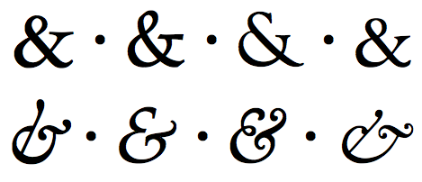
In contrast, the ampersand associated with italic typefaces is a more playful symbol which wears its heritage as an et-ligature on its sleeve. Often thought of as ancillary to roman characters, italics originally comprised an entirely separate alphabet modelled on the fluid, informal handwriting of a Renaissance scribe and copyist named Niccolò Niccoli.11 The sloping, condensed letterforms of the first italic typefaces made more efficient use of paper than their roman counterparts and due to this many early printed books were set entirely in italics.
Strange as it may seem now, the earliest italic fonts came with lowercase letters only; the solution was to set Italic Lowercase With Roman Capitals.12 Not only that, but even after italics had acquired proper uppercase letterforms, the combination of roman and italic type in the same work — one for contrast or emphasis and the other for body text — did not become common until the 17th century.13
Italic letterforms diverge from their roman counterparts in small but noticeable ways: compare aefkpvwz with ‘aefkpvwz’, for example.† Though not all these variations are present in all italic alphabets, true italics (as opposed to sloped, or ‘oblique’ roman letterforms) will always display at least some of these distinguishing features. Similarly, the italic ampersand has become something of a playground for typographers, and many italic ampersands are intricately designed works of art when compared to their conformist roman counterparts.14
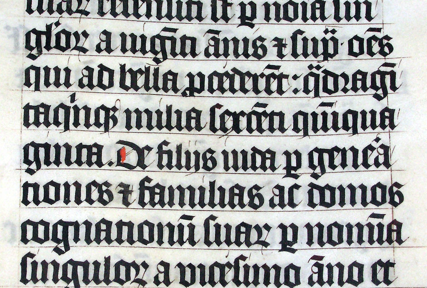
Lastly, and somewhat aberrantly, the Gothic, or blackletter style of writing — characterised by angular letterforms and densely packed text — more commonly forewent the ampersand altogether and instead made use of the Tironian et.
Blackletter shares a common ancestor with roman type: while the typecutters of the Italian Renaissance reproduced the original 9th century letterforms of Carolingian minuscule in their ‘roman’ typefaces, blackletter instead represents the evolution of Alcuin’s alphabet as it continued in daily use.15 Most prevalent in Germany and Northern Europe, when Johannes Gutenberg printed his forty-two-line bible in 1455, intended to mimic a handwritten manuscript, blackletter was the obvious alphabet in which to set it.16
The Tironian et garners a scant forty-eight entries in Tschichold’s taxonomy (most of them in blackletter) compared to over two hundred ampersands, and this is symptomatic of its ultimate marginalisation in the ill-fated blackletter alphabet. While the ampersand went from strength to strength, providing a canvas on which calligraphers and typographers could indulge their artistic proclivities, the Tironian notes suffered near-extinction in the Middle Ages, victim of a curious linguistic witch hunt. The secrecy and cipher-like nature of both traditional runic writing and shorthand did not sit well with the distrust of witchcraft and magic prevalent in those times, and Tiro’s system fell out of use.17 Briefly revived in the 12th century, and later inspiring a series of copycat notations in English and other languages,18 the notae Tironianae were nevertheless a spent force. The Tironian et was the sole survivor, soldiering on in blackletter type until it too fell out of use in the mid 20th century.19 Ironically, this supremely Germanic alphabet was finally banished by a 1941 Nazi decree condemning it as Judenlettern, or ‘Jewish characters’,20 and today it appears mainly in newspaper mastheads and the occasional document intended to convey a Teutonic flavour.
Today, the ampersand reigns almost supreme, with the Tironian et surviving in the wild only in Irish Gaelic:
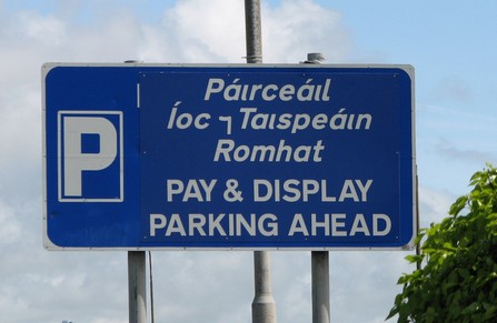
Like this road sign, the Tironian et showed the way, but the ampersand was the real destination.
- 1.
-
Tschichold, J., and R. McLean. “Introduction to the English Language Version”. In The New Typography. University of California Press, 2006.
- 2.
-
Tschichold, Jan. Die Neue Typographie : Ein Handbuch für zeitgemäss Schaffende. Bildungsverband der Deutschen Buchdrucker, 1928.
- 3.
-
Encyclopaedia Britannica. “Jan Tschichold (German Typographer and Author)”.
- 4.
-
Aicher, Otl. “Typographical Warfare”. In Texts on Type: Critical Writings on Typography, edited by Steven. Heller and Philip B. Meggs. Allworth Press, 2001.
- 5.
-
Tschichold, Jan. Formenwandlungen Der &-Zeichen. D. Stempel AG, 1953.
- 6.
-
Tschichold, Jan, and Frederick Plaat. {The Ampersand: Its Origin and Development}. Woudhuysen, 1957.
- 7.
-
Standard, Paul, and . The Ampersand : Sign of Continuity. George Grady Press, 1936.
- 8.
-
Goudy, Frederic W, and Frederic W of Congress. Ands & Ampersands, from the First Century B.C. To the Twentieth A.D. Typophiles, 1936.
- 9.
-
Clark, C.U. “How Our Roman Type Came to Us”. The North American Review 195, no. 677 (1912): 546-549.
- 10.
-
Bringhurst, Robert. “7.2.1 The Renaissance Roman Letter”. In, 122-123. Hartley and Marks, Publishers, 2008.
- 11.
-
Ullman, B.L. “A Rival System - Niccolò Niccoli”. In The Origin and Development of Humanistic Script, 59-77. Ed. di storia e letteratura, 1974.
- 12.
-
Bringhurst, Robert. “7.2.2 The Renaissance Italic Letter”. In, 124-125. Hartley and Marks, Publishers, 2008.
- 13.
-
Bringhurst, Robert. “3.4 Tribal Alliances and Families”. In The Elements of Typographic Style : Verson 3.2, 57. Hartley and Marks, Publishers, 2008.
- 14.
-
Hoefler, Jonathan. “Our Middle Name”. Hoefler and Frere-Jones, April 2008.
- 15.
-
Bischoff, Bernhard, and . “Latin Handwriting in the Middle Ages”. In Latin Palaeography: Antiquity and the Middle Ages, 127-136. Cambridge University Press, 1995.
- 16.
- 17.
-
Russon, Allien R. “History and Development of Shorthand (shorthand)”. Encyclopaedia Britannica.
- 18.
-
Bischoff, Bernhard, and . “Latin Script in Antiquity”. In Latin Palaeography: Antiquity and the Middle Ages, 80-82. Cambridge University Press, 1995.
- 19.
-
Rosendorf, Theodore. “Blackletter”. In The Typographic Desk Reference, 100+. New Castle, DE: Oak Knoll Press, 2009.
- 20.
-
Reuveni, G. “From Reading Books to Consumption of Books and Back Again”. In Reading Germany: Literature and Consumer Culture in Germany Before 1933. Berghahn Books, 2006.
Comment posted by The Modesto Kid on
Another tour de force. Thanks so much. (Noticing the distinction between roman and italic “g” and “a” was a big part of my becoming infatuated with lettering as a young lad.)
Comment posted by Keith Houston on
Hi MK,
Even after having been quite thoroughly educated by Bringhurst’s Elements of Typographic Style, the roman/italic distinction that still occasionally fazes me is that they’re considered to be separate ‘alphabets’. It’s a matter of degrees, I suppose; on its own, any one of sloping versus upright letterforms, transitive versus reflexive serifs or ‘a’ versus ‘a’ probably wouldn’t be enough to qualify, but the combination does yield something quite distinct.
Thanks for the comment!
Comment posted by Andy Wilson on
Hi Keith,
Another excellent Shady Characters post, thanks! However, where’s the promised discussion of ‘rote learning and the use of “and per se and” ’ (http://www.shadycharacters.co.uk/2011/06/the-ampersand-part-1-of-2/#comment-729). Please could you considering add a Adams-istic (http://en.wikipedia.org/wiki/The_Hitchhiker%27s_Guide_to_the_Galaxy#Novels) part 3 of 2 to cover the etymology of the word “ampersand”?
Cheers,
Andy.
Comment posted by Andy Wilson on
Ah, just noticed, that you’ve said that there’s more to come (http://twitter.com/#!/shadychars/status/85080680391913472).
Looking forward to it!
Comment posted by Keith Houston on
Hi Andy,
There will indeed be a part 3 of 2, or perhaps a part 2½ of 2. The discussion of the ampersand’s name didn’t quite fit in with the rest of my notes about its visual development, and so I’ll talk a little about it next weekend.
Thanks for the comment!
Comment posted by HP on
Not to venture too far afield, but did you run across anything in your research about handwritten ampersands? Growing up in the second half of the 20th c. in the American midwest, we were all taught D’Nealian script, which AFAICT has no ampersand. My own attempts at handwritten ampersands always turned into treble clefs (and sometimes vice versa), but I recall a sort of “vernacular ampersand”* showing up in the handwriting of my contemporaries that seemed to me to come out of nowhere. I was half expecting to see its historical antecedent among the numerous examples in this post.
* I can only describe it as a sort of backwards-3 or large lowercase epsilon, with a short vertical bar centered on the x-height.
Comment posted by The Modesto Kid on
Yep, I know that symbol. I don’t think I’ve ever seen it in a font though, only in handwriting.
Comment posted by almeda on
There’s a nice collection of handwritten ampersands here (http://tinge.net/work/), which also includes various versions of the epsilon-with-a-line-through-it that you mentioned.
I’d be interested to know whether it has a proper name or digital version too.
Comment posted by Gordon P. Hemsley on
Noting also that the vertical line does not always go all the way through it—sometimes it’s just short vertical lines above and below.
Then there’s the use of ‘+’ instead of ‘&’, a use which could stem from the Tironian et, given the form used in the Belgian bible excerpt.
Comment posted by Chris on
The + is generally thought to indeed stem from the Tironian et, which became crossed (and then doublecrossed) over the course of the Middle Ages.
Comment posted by Keith Houston on
I’d suspected that might be the case, and the Tironian et in the Belgian bible image would seem to be a plausible intermediate step along the way.
Thanks for all the commentary on this!
Comment posted by andrew wilson lambeth on
my sense is that they’re all transcriptions of the letters e and t, whatever they look like . the crossed-epsilony-thing—which i handwrite myself—seems to be a monogram, the two letters overlapped . the italic ampersands are clearly e and t in lowercase and the roman ampersand is a capital e followed by a lowercase t, somewhat tangled . so—if we were being logical about this—since we like to mix caps and lowercase*—each case should have its own ampersand : a cap-height one as generally provided with the roman, and a median x-height one much like the traditional italic . but we’d then need not only the belated addition of the missing ampersand to every font ( a lowercase for every roman, a cap for many italics ) but probably also a revised keyboard for this, with a new key for ampersand and shift-ampersand . and maybe that’s asking rather a lot
* yeah, i know
Comment posted by Keith Houston on
Hi Andrew,
Given that OpenType allows for contextual alternatives, it wouldn’t surprise me if it’s already possible to support different ampersands in different contexts. Whether that could be extended as far as uppercase and lowercase-specific ampersands, I’m afraid I don’t know! Perhaps any typographers reading Shady Characters might want to weigh in.
Comment posted by james on
There is a few typefaces that have a lowercase ampersand Hoefler Text is one but most others are Arial unicode and other system fonts.
﹠﹠.
Unicode U+fe60 or ﹠ for html.
keyboard: hmmmm Not got a clue.
Comment posted by Keith Houston on
Hi James,
Thanks for that. I recently discovered Word’s actually-quite-helpful Unicode input method. You type the hexadecimal code and then hit Alt+x — et voila, your character is produced. On a Windows laptop without a numeric keypad, this is a godsend!
Comment posted by Diane on
I am madly keen to know the origin of the ampersand used in Adobe’s “Bickham Script.”
It doesn’t seem to belong in the Roman or Irish tradition at all. Did George Bickham ever really use it? Did Adobe make it up? Is it indigenous to America, or does it hark back to that Greek shorthand which started Cicero wanting similar for Latin?
Also – where can I find information about the classical Greek shorthand (if there is any), or indeed any scribal shorthand meant for writing Greek?
All this because, quite independently in researching another medieval ms, I decided that a particular form probably meant something like “etcetera, etcetera”.. and behold, it’s pretty well exactly the same sign that Adobe has used for an ampersand in its “Bickham script”!!
Comment posted by Keith Houston on
Hi Diane,
Thanks for the comment! I’m afraid my knowledge of ancient Greek shorthand is limited to Cicero’s interest in it, which in turn comes from the references in The Ampersand, part 1. Sorry I can’t be of more help!
Comment posted by andrew wilson lambeth on
hi diane,
i don’t think the bickham script ampersand form is so rare—it’s just that it is most often found in signwriting, especially on old company windows and letterheads, rather than in fonts . it is really a swashed amplification of the standard form and—perhaps because the ampersand is so frequently found at the visual centre of a company name ( as in Something & Somebody ) and hence invites a signwriter’s elaboration—the forward swash is sometimes looped completely round the character anticlockwise, or it may be that the tail swash is taken for most of a clockwise circuit round the back, or there is even the possibility of tangling both of them in a fancy knot . this sort of swash-play comes from the model of the excesses of eighteenth century penmanship, and engraving, of which bickham himself was both a showman and a master, and survives today in almost all banknote figuring and financial marks . the sign you mention for etcetera—&c—is also a common eighteenth century handwritten form, especially in business ledgers, and took many idiosyncratic forms ( the more swashed it looks, perhaps the more sighing with exhaustion it should sound in the mind )
as for the ancient greeks, their alphabetic script was, for them, a cleverly abbreviated and fairly recently adopted shorthand in itself, which is to say that it was a lot shorter to write than the rather involved and far from memorable syllabaries they had inherited, so they probably felt they were using a pretty streamlined hand as it was . but it’s not impossible that the greeks too had devised a real shorthand of their own, given that many of their surviving philosophies are recorded as transcribed conversations : certainly the need for fast transcription must always have been felt, throughout the history of the written word, when speech flies too fast for the writer of a documentary account, and perhaps also when secrecy of note-taking is desirable . but i don’t know of an instance of ancient greek shorthand myself
Comment posted by Keith Houston on
For anyone in any doubt as to the magnificence of Adobe’s Bickham Script swash ampersand, take a look here. As Andrew suggests, it would look particularly grand in a “Somebody & Somebody” nameplate.
Comment posted by Sumner Stone on
Very informative Keith. I do suggest that in your attributions you name the designer(s) of the typeface in addition to or instead of the companies that now happen to sell them.
Comment posted by Keith Houston on
Hi Sumner — that’s a great idea, thanks! I’ll update the post accordingly.
Comment posted by Luke Turnbull on
I love the font on this page – what is it?
Comment posted by Keith Houston on
Hi Luke,
It will be the first font you have installed from the following list: Hoefler Text, Constantia, Palatino, Palatino Linotype, Book Antiqua, Georgia, Droid Serif, Roboto Slab, or a generic serif font.
In practice, this usually means Hoefler Text on a Mac or Constantia on a Windows machine. It’s possible to find out for sure in most desktop web browsers by right-clicking on a piece of text and selecting “Inspect element”.
I hope this helps. Thanks for the comment!
Comment posted by Michael E. Pollock on
I am looking for the name of a symbol in Old English and Secretarial script that represents the letters “p” and “r” with a vowel between them, thus “p”ish would be read as “parish” and “p”tion would be read as “portion”. It looks like the letter “V” transected near the top by “U” that has been rotated 90 degrees counter-clockwise. I am also looking for a set of fonts that would include this symbol and other Old English/Secretarial symbols such as the thorn.
Comment posted by Keith Houston on
Hi Michael — I’m not the best person to ask about palaeographic matters such as this, I’m afraid. Having said that, a Google search turns up Ted Staunton’s “Elizabethan” font that may be of use.
Also, the Bodleian’s guide to secretary hand abbreviations mentions a similar example to the one you cite, using “particulars” rather than “parish”. However, rather than using a dedicated letter for the “par-” prefix, they suggest that it’s a simple p with a “loopback” indicating that there are missing letters. I hope this helps, and thanks for the comment!
Comment posted by Michael E. Pollock on
Keith,
I have seen the same explanation you shared of the symbol for which I am seeking, to wit, a “p” with a loopback, but that the nature of the loopback indicated the missing vowel. There does appear to be some validity to the same in the examples used in Bodelian Guide to Secretarial Hand Abbreviations.
However, in the examples cited there, all the examples lack the v-shaped “dip” with which I am familiar.
I offered the example of “pish” for parish because it is the specific example I have encounter the most frequently in my work as a genealogist, and my being aware of the symbol, the context where it appears is such that I tend to recognize it immediately.
That said, I recently encounter another usage where it was not until the third usage in as many paragraphs that I recognized it, in part because it was a stand-alone where it preceded the name of one individual who was acting under the authority of another.
The “Elizabethan” font is not complete, as in true Secretarial script, a lower case “e” was a mirror-image of itself, looping backward rather than forward, and the lower case “c” looked like an “r”, linking to the following letter from the top rather than bottom, but without a “dip” at the “stem” before continuing to the next letter that makes “r” recognizable as “r”. The secretarial “s” is also missing from the font.
BTW, both a Secretarial “s” and “c” are used, the “s” twice, in the Bodelian guide to secretary hand abbreviations in the example of “discourse”, but the actual spelling of discourse in the example, I believe, is “discorse”.
Thank you again!
Comment posted by Keith Houston on
Not at all! Sorry I can’t be of more help, but I’m sure that there must be experts out there who can. Perhaps you could contact the Bodleian directly to find out who wrote their guide to secretary hand?
Comment posted by Michael E. Pollock on
I will certainly contact the Bodleian Society and let you know what response I get.
Thank you again.
Comment posted by Keith Houston on
Great! Good luck, and please do let us know what they say about the p-with-loopback.